
Retail Interior Visualization: A Study in Burgundy
- gad the mad

- Jun 18
- 4 min read

Retail interior visualization is not only about showing a space. It is about communicating how a brand feels before a customer ever steps inside.
For this visual study, GAD recreated and rendered an Aesop-inspired retail interior to explore how materiality, lighting, colour, and atmosphere can work together to shape a quiet but memorable brand experience. Inspired by the refined spatial language of Aesop’s flagship interiors designed by Studio Odami, this series became an exercise in restraint — a study in burgundy, warmth, rhythm, and calm.
Created using Twinmotion, the project allowed us to look closely at how commercial interior rendering can move beyond documentation and become a tool for storytelling.
Designing Atmosphere Before Detail

In retail interior visualization, the first responsibility is not to show every object equally. It is to guide attention.
This space is built around a deep burgundy palette, softened by warm linear lighting and balanced with tactile stone counters. The repetition of shelves, vertical grooves, product bottles, and curved architectural elements creates a rhythm that feels both immersive and controlled.
Rather than making the render feel overly bright or clinical, we focused on creating a calm, intimate mood. The lighting is warm, the shadows are soft, and the red tones wrap the space almost like a single material gesture. For brand-led interiors, this kind of atmosphere is often more powerful than visual excess.
Why Materiality Matters in Retail Interior Visualization

A strong retail space is remembered through touch, tone, and proportion. Even in a still image, materiality should feel present.
The burgundy wall panels, ribbed surfaces, terrazzo-like flooring, and stone counters were treated as more than background elements. They define the visual identity of the space. Each surface catches light differently, creating subtle variation within a monochromatic environment.
This is where retail interior visualization becomes valuable for designers, developers, and brands. A render can test whether a material palette feels premium, whether the lighting supports the concept, and whether the customer journey feels emotionally aligned with the brand.
Lighting as a Brand Experience

Lighting is one of the most important tools in commercial interior rendering. In this project, the lighting was designed to feel warm, precise, and atmospheric.
The linear lights do more than illuminate the products. They create hierarchy. They pull the eye across the counters, shelves, and curved wall details. They also give the burgundy palette a richer, more cinematic quality, helping the space feel quiet and immersive rather than flat.
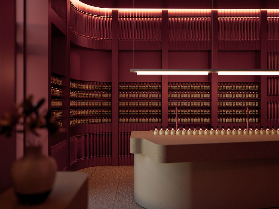
For GAD, retail visualization is about understanding how these details work together. A render should help a client see not just what the interior looks like, but how the interior behaves under light.
From Product Display to Spatial Storytelling
The repetition of bottles across the shelves and counters creates a sense of order, but the visuals are not only about product display. They are about brand ritual.
The counter becomes a point of interaction. The shelving becomes a backdrop. The warm glow creates a sense of pause. Every element contributes to the feeling of a carefully composed retail environment.

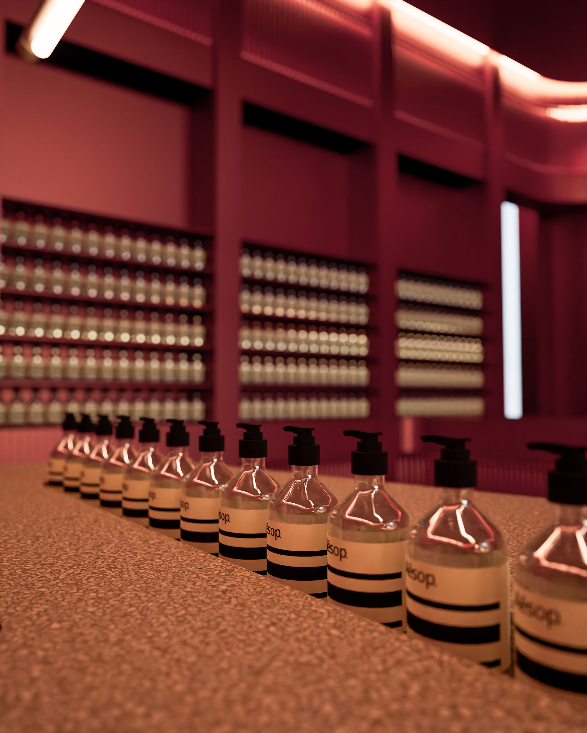
This is especially important for premium retail interiors, where the experience of browsing is often as important as the product itself.
Through retail interior visualization, a brand can study how scale, lighting, circulation, and display come together before the space is physically built.
Rendered in Twinmotion as a Visual Study
This series was developed through Twinmotion as part of GAD’s ongoing explorations in retail visualization and commercial interior rendering.
Twinmotion allowed us to study the mood of the space quickly while still focusing on the essentials: light temperature, reflections, depth of field, colour balance, and atmosphere. The goal was not to create a loud visual, but a controlled one — a render that feels composed, warm, and brand-aware.
For us, this project is a reminder that architectural visualization is not just a technical output. It is a way to understand design intent.
How Retail Visualization Helps Brands and Designers
For retail brands, developers, architects, and interior designers, retail interior visualization can support the design process in several ways.
It helps communicate mood before construction begins. It allows material and lighting options to be tested visually. It gives stakeholders a clear understanding of the customer experience. Most importantly, it turns design intent into a story that can be shared, reviewed, marketed, and remembered.
A successful retail render does not simply show shelves, counters, and products. It communicates identity.
Conclusion
A Study in Burgundy is an independent visualization exercise by GAD, inspired by the refined calm of Aesop’s retail interiors and the material sensitivity of Studio Odami’s design language.
Through this series, we explored how burgundy tones, warm lighting, repeated forms, and carefully composed product displays can create a strong brand atmosphere. As a retail interior visualization study, the project reflects our belief that great visuals should do more than represent space — they should communicate feeling, hierarchy, and experience.
At GAD, we create architectural and retail visualizations that help brands, designers, and developers communicate the atmosphere behind their spaces.


Comments